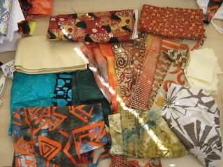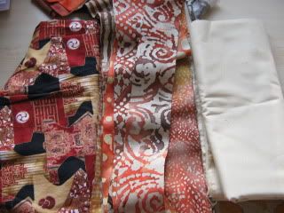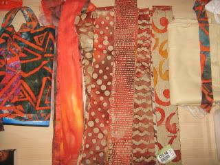
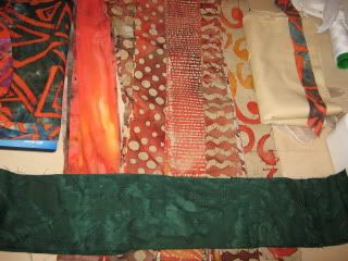
As you can see the tonal range is not great and I feel the secondary patterns I like to find would get lost. I added a dark green batik to see how that would look as a feature fabric. It helps but is is still a bit bland.
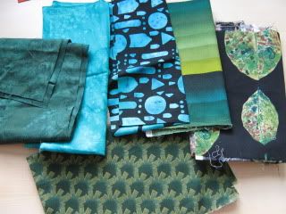
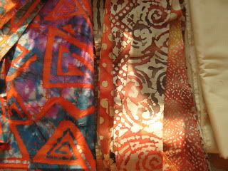
Remembering my colour wheel work I hunted until I could find the complimentary colour to orange, turquoise. Why I didn't think of this before I don't know as they are the two colours I love to paint in the most..
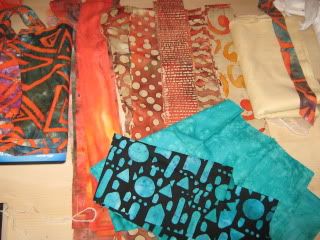
Now that does seem to make it sing. Any other ideas as to how I can give this a bit of oomph? I play on using this http://www.youtube.com/watch?v=7DFo-mIa ... plpp_video and using the small squares left to make a border.
What do you think guys?